
Thursday, 24 March 2011

Music Magazine Final Front Cover

Monday, 21 March 2011
Music Magazine Double Page Spread Production

Monday, 14 March 2011
Music Magazine Contents Page Production

Here is the production of my contents page. It is not yet finished as I still havn't added any images to it yet. Down the right hand side of the page is the page title saying 'Contents'. Down the left hand side of the page is the cover lines from the magazine cover. This time they have more detail saying what the article is about underneath them, also next to each of the articles is a number, which is what page the article is featured on. Two of the articles have the same number this is because this is my double page spread & I am featuring both an article and an interview on that page. From the cover to the contents page I have kept the same colour scheme of reb, black, white and grey. This colour scheme was the one that recieved the most votes through my questionnaire. I am going to continue to use this colour scheme on my double page spread


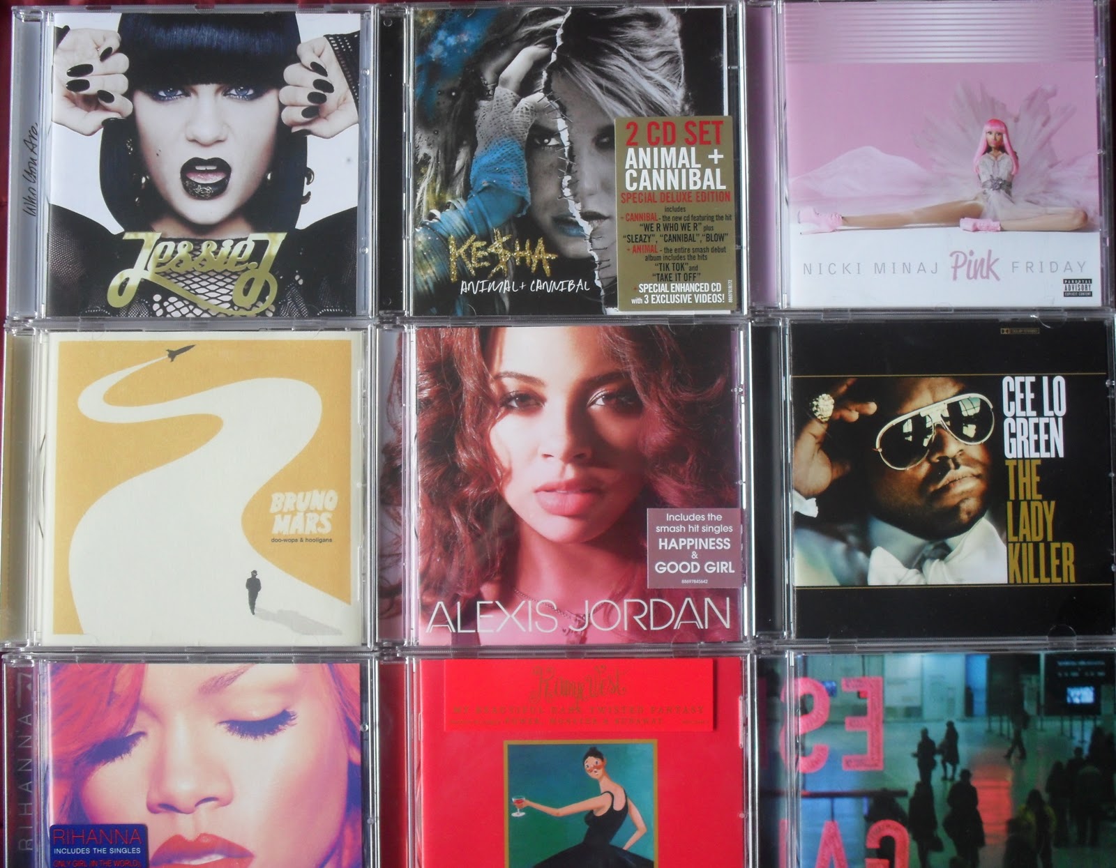

For the articles that are featured on my contents page I am going to use images to illustrate the articles. For the 'What's new in music this month' article I have taken a picture of CD's that were released by artists from the start of 2011 and the end of 2010 so that the albums are either brand new or fairly new. The image on the left is the original image, the image on the right has been cropped and straightened.
For the article titled 'End of an Era' I have used an image from that I had I taken at one of the Lady Gaga concerts I attended last year. I used my photo from her encore which is symbolising the end of the show as the article is talking about her show coming to an end and the release of her new album which she is touring with at the end of 2011.
The article which is titled 'Coming to the UK' I am going to take a picture of the Union Jack. Rather than the American flag to symbolise that this is a British music magazine and even though it is still featuring American artists it is focusing on the effect the music will have on the UK chart and music industry.
The article which is titled 'Coming to the UK' I am going to take a picture of the Union Jack. Rather than the American flag to symbolise that this is a British music magazine and even though it is still featuring American artists it is focusing on the effect the music will have on the UK chart and music industry.
For the article that is titled '2011 Festivals & Tours' I have taken pictures of my tickets that I had from concerts and shows I visited last year. I took two pictures and used two different angles but out of the two pictures I used I prefer the second one so that is the image that I will feature on my contents page.
Music Magazine Cover Production

Here is what the cover for my magazine will look like. At the moment there is no image on the cover. For the image I'm going to use a picture that I took whilst at one of her concerts last year. I was at three of her shows last year (Newcastle,Manchester & London).
Featured on my magazine is a masthead 'Revoulution' placed on a red banner to make it stand out. Just below the masthead is a bar code and a price for the magazine, this is use to make it seem more realistic. There are four cover lines each with it's own story line. Across the middle of the page is the main cover line which is 'Lady Gaga' this is because I'm going to use an image of her on the front cover and also on my double page spread is going to be an article about her and the end of her tour. Although there is no story line about her on the cover, on the contents page there is information about the article that is on my double page spread. The contents page will also feature more information about each of the cover lines.
Wednesday, 9 March 2011
Music Magazine Double Page Article Planning


Above are my four ideas for my double page spread which is either going to be an article or an interview. On each of the ideas I have tried the title in different positions, the picture(s) in different positions & where the article/interview should be placed.

Here is the double page spread I decided to go with. On the left hand side of the double page will be a picture of the person who the article or interview is about/with. Down the centre of the page - at the top is the title of the article/interview and below that is the actual article/interview, I will split it into columns as it is likely to be over the center of the two pages. On the right hand side of the page is going to be another section which is about what's new in music, such as new artists or new albums.
Music Magazine Contents Page Planning

Here are my ideas for what the contents page in my music magazine should look like. For each of the designs I tried a different amount of images and placed the title in different places.

This is the design that I choose for my contents page. It has the title going down the right hand side of the page. Down the centre of the page will be 4 images, these images could be relating to the four cover lines that are featured on the cover or they could relate to the article/interview on the double-page spread. On the left hand side of the contents page is the four cover lines from the cover but this time with more detail written underneath the articles.
Music Magazine Cover Planning

Above is a scanned image of my four ideas for what my music magazine cover should look like. All of the covers are different from each other. I placed cover lines in different places & tried the main cover line in different places. I have also placed the image that will be on the cover in different places but kept the masthead in the same place on all of the different ideas.

Here is the cover which I choose to use for my music magazine. It will contain a large image placed in the middle of the cover with the main cover line going over the image. There will also be four cover lines on the cover spaced evenly over the cover. At the top of the cover is the masthead, the image may be placed slightly over the masthead or I may place the masthead over the image, it depends what looks best.
Subscribe to:
Comments (Atom)