This is the evaluation of the whole of my coursework. I am going to write about not only the finished product of my magazine but also the production and the research. I am going to write about who the audience for my magazine is, how it represents the people who read it, how I made my magazine attract my audience, what I have learnt from constructing this product and finally looking back at my preliminary task and reviewing my progress.
First of all I am going to write who the audience for my media product would be. I think that for my media product the audience would be teenagers - young adults and my target audience research was based on people aged 16 - 19 so I think that my magazine would most likely attract people within 2-3years range of that e.g. going up to age 22 or even down to 13. My magazine is mostly based on chart music and also what is new in music however if the magazine was based on my own preferences it would contain a large variety of music. I think by basing my magazine on that it is likely to attract a young audience.
To address/attract my audience I went and looked at my target audience research and based my product on that as much as I could. The colour scheme that is used throughout the magazine was based on the colour scheme that was chosen through my target audience research, the colour scheme that has been used was the one that had the most votes so therefore by using it on the cover and throughout the magazine it is likely to attract that audience.
To make my magazine address/attract my target audience I referred to my target audience research a lot. On the questionnaires I handed out there was a question asking who/what my audience would like to see on the cover, whether it be a female solo artist, male solo artist or a group. Through my research I found that both male & female solo had roughly equal votes so therefore I had a choice of who to use for my cover. Whichever I picked was likely to appeal to my audience.
My research also included finding out what kind of music my audience listen to. Using this I can easily make my magazine address/attract my target audience as I am able to write cover lines & articles that will make my audience want to read the magazine. Due to the time of year & the fact that tickets would be going on sale soon I decided to use tours & festivals for cover lines, I also included cover lines about what is new in music. The final thing that I used to attract/address my audience was a cover star for the cover of my magazine; this was going to be the image that will draw people’s attention to my magazine so I decided to use one of my pictures from a recent concert I had been to. I used a photo I had taken of Lady Gaga when she was standing in front of me. I knew that using Lady Gaga would easily attract people to my magazine as she is currently the biggest star on the planet. Her latest single Born This Way went to #1 on all 23 iTunes countries within 4hours of release, her debut album went diamond worldwide, she has 5 Grammys, she is the most followed person on Twitter with over 9million followers, over 30+ million 'likes' on Face Book & is the queen of YouTube with over 1billion views and has only been in the UK since January 2009 & the US since October 2008. So by using Lady Gaga as the cover star for my magazine I knew that I would be able to attract my target audience easily.
My product represents is able to represent a particular social group as it was based on research into what 16 - 19 years olds like/prefer to see in music magazines.
By producing this I have learnt quite abit about the technologies used. I learnt about manipulating the image for the cover. I didn't just use the original image that was taken I had to cut the image for the cover so therefore it was just the figure.
Looking back at my preliminary task I feel that I have learnt a lot from that to the full product. When I look back at the preliminary task I don't think I put too much effort into it. It wasn't very colourful and wasn't very likely to attract anyone to the magazine. For the preliminary task the cutting of the image was very rough, the cover wasn't filled e.g. there was a lot of empty space around the main image and also the text wasn't very large so was very unlikely to attract anyone to the magazine. Also the colour scheme for the preliminary task was abit boring. It also didn't contain much information on the cover, e.g. For the preliminary task I personally don't think I would buy the magazine therefore I can't think that other people would want to buy the magazine, however with my final product I know that if I seen that magazine I would buy it so therefore I now think that other people would be likely to buy it too.
Monday, 11 April 2011
Audience Feedback - Cover, Contents Page & DPS (& Improvements)
Cover -
Audience feedback for the cover of my music magazine was that the cutting of the image needed to be improved. I will cut the image again to improve it therefore it will give the cover of my music magazine a more professional look.
Contents Page -
for my contents page the audience feedback was positive so therefore I won't need to make any improvements on my contents page.
DPS -
For my double-page spread the audience feedback was that the size of text was too big. I will need to make the size of the text of smaller to make it look more like an article that would be featured in a professional music magazine, this also means that I will have to include more information in my article to fill the space created by resizing the text.
IMPROVMENT

Thursday, 24 March 2011


Music Magazine Final Front Cover

Monday, 21 March 2011
Music Magazine Double Page Spread Production

Monday, 14 March 2011
Music Magazine Contents Page Production

Here is the production of my contents page. It is not yet finished as I still havn't added any images to it yet. Down the right hand side of the page is the page title saying 'Contents'. Down the left hand side of the page is the cover lines from the magazine cover. This time they have more detail saying what the article is about underneath them, also next to each of the articles is a number, which is what page the article is featured on. Two of the articles have the same number this is because this is my double page spread & I am featuring both an article and an interview on that page. From the cover to the contents page I have kept the same colour scheme of reb, black, white and grey. This colour scheme was the one that recieved the most votes through my questionnaire. I am going to continue to use this colour scheme on my double page spread


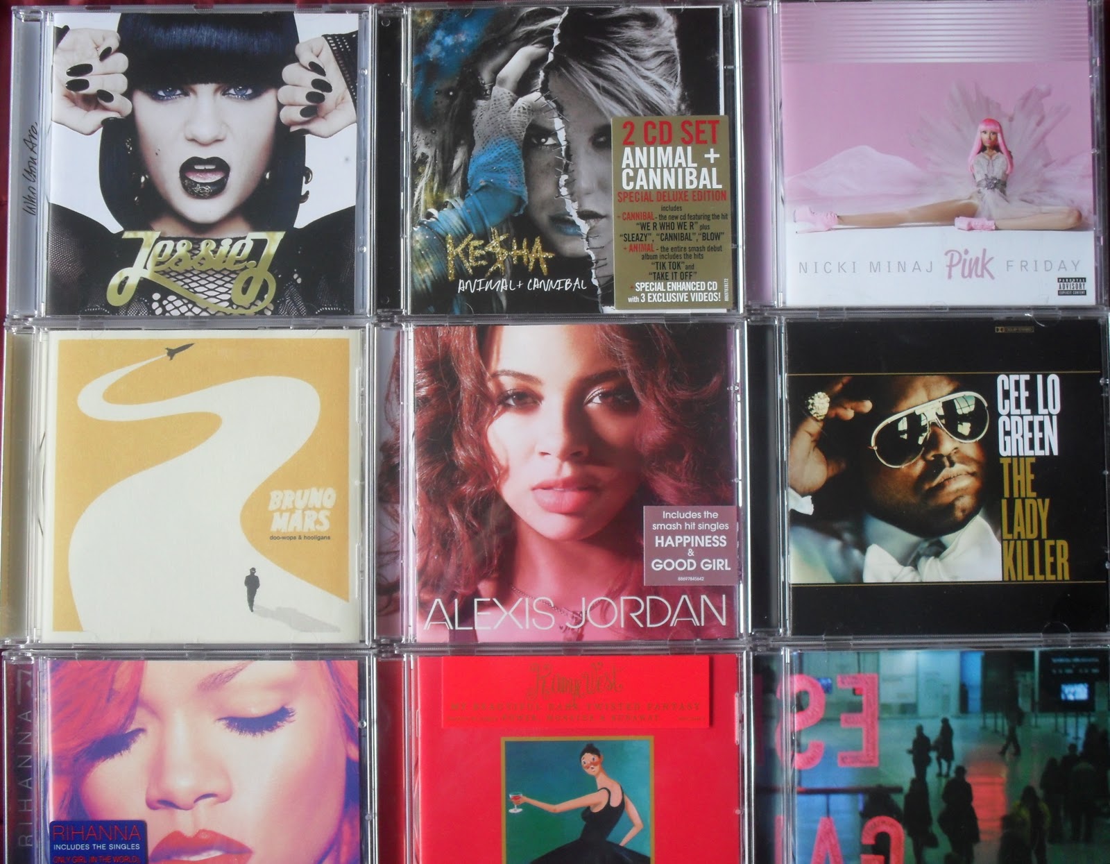

For the articles that are featured on my contents page I am going to use images to illustrate the articles. For the 'What's new in music this month' article I have taken a picture of CD's that were released by artists from the start of 2011 and the end of 2010 so that the albums are either brand new or fairly new. The image on the left is the original image, the image on the right has been cropped and straightened.
For the article titled 'End of an Era' I have used an image from that I had I taken at one of the Lady Gaga concerts I attended last year. I used my photo from her encore which is symbolising the end of the show as the article is talking about her show coming to an end and the release of her new album which she is touring with at the end of 2011.
The article which is titled 'Coming to the UK' I am going to take a picture of the Union Jack. Rather than the American flag to symbolise that this is a British music magazine and even though it is still featuring American artists it is focusing on the effect the music will have on the UK chart and music industry.
The article which is titled 'Coming to the UK' I am going to take a picture of the Union Jack. Rather than the American flag to symbolise that this is a British music magazine and even though it is still featuring American artists it is focusing on the effect the music will have on the UK chart and music industry.
For the article that is titled '2011 Festivals & Tours' I have taken pictures of my tickets that I had from concerts and shows I visited last year. I took two pictures and used two different angles but out of the two pictures I used I prefer the second one so that is the image that I will feature on my contents page.
Music Magazine Cover Production

Here is what the cover for my magazine will look like. At the moment there is no image on the cover. For the image I'm going to use a picture that I took whilst at one of her concerts last year. I was at three of her shows last year (Newcastle,Manchester & London).
Featured on my magazine is a masthead 'Revoulution' placed on a red banner to make it stand out. Just below the masthead is a bar code and a price for the magazine, this is use to make it seem more realistic. There are four cover lines each with it's own story line. Across the middle of the page is the main cover line which is 'Lady Gaga' this is because I'm going to use an image of her on the front cover and also on my double page spread is going to be an article about her and the end of her tour. Although there is no story line about her on the cover, on the contents page there is information about the article that is on my double page spread. The contents page will also feature more information about each of the cover lines.
Wednesday, 9 March 2011
Music Magazine Double Page Article Planning


Above are my four ideas for my double page spread which is either going to be an article or an interview. On each of the ideas I have tried the title in different positions, the picture(s) in different positions & where the article/interview should be placed.

Here is the double page spread I decided to go with. On the left hand side of the double page will be a picture of the person who the article or interview is about/with. Down the centre of the page - at the top is the title of the article/interview and below that is the actual article/interview, I will split it into columns as it is likely to be over the center of the two pages. On the right hand side of the page is going to be another section which is about what's new in music, such as new artists or new albums.
Music Magazine Contents Page Planning

Here are my ideas for what the contents page in my music magazine should look like. For each of the designs I tried a different amount of images and placed the title in different places.

This is the design that I choose for my contents page. It has the title going down the right hand side of the page. Down the centre of the page will be 4 images, these images could be relating to the four cover lines that are featured on the cover or they could relate to the article/interview on the double-page spread. On the left hand side of the contents page is the four cover lines from the cover but this time with more detail written underneath the articles.
Music Magazine Cover Planning

Above is a scanned image of my four ideas for what my music magazine cover should look like. All of the covers are different from each other. I placed cover lines in different places & tried the main cover line in different places. I have also placed the image that will be on the cover in different places but kept the masthead in the same place on all of the different ideas.

Here is the cover which I choose to use for my music magazine. It will contain a large image placed in the middle of the cover with the main cover line going over the image. There will also be four cover lines on the cover spaced evenly over the cover. At the top of the cover is the masthead, the image may be placed slightly over the masthead or I may place the masthead over the image, it depends what looks best.
Sunday, 27 February 2011
Target Audience Research Analysis
Here are the graphs which were produced form my results which came from my questionnaire. Each graph shows the results to the answers from each question. I handed out 20 questionnaires to people aged 16 - 19 as that is my target audience. I will be able to use these results to help me design a music magazine to look how the people who are most likely to read it want it to look.

Here are the results from my first question, the first question was just to be able to see who was answering the questions. The majority of the people who answered my questionnaire were female, the graph shows that about two thirds of the people who answered were female.

The second question on my questionnaire was to find out which was the most popular genre of music for my target audience. I gave 8 options to choose from which gave a variety of music to choose from and only 5 were selected. This could be due to the size of the sample or the age group. The most popular genre of music which was selected was pop/rock, this shows that my magazine should be about pop/rock music, however it could also feature some information about another two genres that were selected just to create some variety within the magazine, like most music magazines they're not based on just one genre of music.

The third question I asked was to find out what kind of artist they would like to see on the cover. There were three choices, either female solo artist, male solo artist or group. The two most popular choice were female solo artist and male solo artist. Since male and female solo artist are about equal, I will be able to choose which one I would like on the cover, this gives me the chance to pick which is the most convenient.

The fourth question that I asked was to find out whether people prefer the artist on the cover of the magazine to be looking directly into the camera or to be facing away from the camera. This question will help me be able to create a cover that will appeal to my target audience. As the graph shows people prefer the cover star to be facing directly into the camera rather than away from the camera.

The fifth question that I asked was based on the article that will be featured in my magazine on the double page spread. I asked if people would prefer to see a question and answer style interview with the cover artist or if they would prefer an article based on the music from the artist which is featured on the cover. The results show that the most popular choice would be to have a Q&A style interview with the artist who is on the cover of the magazine.

The last question that I asked the people who answered my questionnaire was which colour scheme they preferred. At the bottom of the questionnaire was a selection of different colour schemes, this was to help whoever was answering the questionnaire see what the colours would look like when placed next to each other. The chart shows that the most popular schemes were the first and second colour scheme. Both of these schemes contained complimentary colours whereas schemes three and four contained contrasting colours.
Wednesday, 16 February 2011
Target Audience Research
For research on my target audience I am going to use a questionnaire, this way I will be able to design my magazine around what the people who are reading it want.

Here is my questionnaire that I will be handing out so that I can decide on how to have the layout of my magazine. It will contain information that will help me design my magazine. It asks people what kind of music they like, therefor I will know what kind of coverlines to write and what kind of genre I need my artist from. Then they're asked what kind of artist they would like to see on the cover, male, female or group. It also asks what colour scheme people prefer that way I am able to choose the colours that appeal to most people. It is also asking how the artist on the front should be positioned and how they interview should be conducted wether it is a Q&A style or Article style. This means not only does the cover attract peoples attention but the main story on the inside keeps people interested.
Monday, 14 February 2011
Music Magazine Double-Page Article Research

Here is a double-page spread from Q magazine's issue with Lady Gaga as the cover star. The main article in this magazine was about Lady Gaga and her rise to fame in 2009. The interview took place just before Lady Gaga was about to start her sold out world-wide tour. The double page contains the title for the article on the left hand side and an image of Lady Gaga from Q's photo shoot which took place in London, nothing is placed in the middle of the pages this is so there is no fold in the writing or image and therefore creates a flawless spread . Q magazine has a colour scheme of red, white and black/grey on every issue of their magazine. Shown here on the double page spread that the colour scheme continues throughout the magazine not just the first few pages from the cover page to the contents page. The title from the article comes from rumours that were circulating about Lady Gaga during her rise to fame throughout 2009.
Underneath the title is a small amount of text which describes what is going to be included in the article, it is not giving much information as Lady Gaga was the cover star for this issue so it is likely that people have bought it to read about her. In the bottom right hand corner is a set of red arrows showing that the article continues on the next few pages and is instructing the reader to turn the page. In the top right hand corner there is information on the photo.

Friday, 4 February 2011
Music Magazine Contents Research


The articles featured on either side of the pages have page numbers next to them, in the size font as the name of the article, the difference with the images is that they have much larger sized numbers on them normally in the corner of the image, this will have been used to make them stand out as they have been placed on such a large image. The use of the numbers on each of the images and articles is the help the reader find the article they want with ease. This issue of the magazine must have been something like a summer issue due to the fact that it has a double page for the contents page.

This is a contents page from the British music magazine NME. The main feature on this page is a large picture in the center of Oasis and underneath is a brief description about their tour. However there is no page number on the article so therefore this is not the main feature of the magazine. Other articles in this issue are featured on the right hand side of the page, if the article was featured as a cover line it is accompanied by a red arrow. This helps the reader find an article that they were attracted to on the cover which makes it much easier to be able to navigate through the magazine. All other articles in the magazine have a number beside them so the reader can easily find what page the article they want to read is on. NME also continue their colour scheme from the cover page onto the contents page. NME use the same colour scheme that Q magazine uses of red, black & white. I think that these colours are used often as when they are used together they are eye catching and can easily grab someones attention.
The articles that are featured in the magazine are displayed down the right hand side of the page. They are all displayed in quite elegant writing this is probably to the fact that Kanye is dressed in a suit and this keeps a smart theme running through the magazine. All of the articles are accompanied with page numbers, this makes it much easier for the reader to navigate through the magazine and find what they want. The two different sections in the magazine are Features and Fashion both of which are displayed in bold lettering this is to separate the articles and help guide the reader to find what they are interested in.
Wednesday, 2 February 2011
Music Magazine Cover Research

This is the British music magazine Q. This is their summer issue of 2009. This issue was released in the June of 2009 when Michael Jackson was set to perform his last tour 'This is it' at the O2 arena in London, however at this time was the untimely death of Michael Jackson. I think they kept his image for this cover as after his death his music entered the charts again and his song 'Man in the mirror' went to number one. Even though the magazine would have sold well originally, I think Q would have kept his image and interview as it would have made a high increase in sales as the magazine was sold out in many shops. A serif font is used on this cover for the main cover line, the rest of the cover lines have a sans-serif font. I think a serif font was used for the main cover line as it seems more professional and was probably used as Michael Jackson is a music legend who still has the best selling album of all time - 'Thriller' also the use of this font is showing authority over the other stories featured in this issue of the magazine. Also on the bottom right hand corner of the magazine is a bar code, this is a conventional look of a magazine.
Q magazine always uses a colour theme of red & white for their masthead and their cover lines. Instead of changing the colour theme every month the person who is on the cover is normally dressed to suit the cover, usually by wearing the colours red, black and gray. Continuously using the same colours shows consistency within the magazine, this shows that every month it will still contain high quality interviews and articles. At the top of the cover is the sell line - 'THE UKS BIGGEST MUSIC MAGAZINE'.

On the cover the masthead is in a sans-serif font however the rest of the cover lines are all used in a serif font. The main cover line is in a larger font than the rest of the cover lines this makes the main cover line standout more and makes it obvious to the reader what the main article is featured in this issue of the magazine. In this issue the masthead is pink, the colour changes with different people on the cover but is mostly red. By using a pink masthead this shows that this issue could be of importance for example this issue is a summer double issue. I think the colour pink was used for the masthead as it matches with the lipstick that Lady Gaga is wearing, which is her lipstick for Mac Cosmetics and her Viva Glam campaign raising money for aids, which has become Mac's best selling lipstick. The pink colour in the masthead may also have been used to coincide with Lady Gaga's skin tone.
The cover lines are all in a bold black font, this is keeping the colour scheme of pink, black and gray. The black font matches with the guns which Lady Gaga is wearing and underneath each cover line is a small description of the story in gray font, this will be used so that you are not distracted from the actual cover line. On the cover there is no sign of a bar code so therefore it must be on the back of the magazine or on the spine/side of the magazine.

Here is the magazine cover from when Cheryl Cole was the cover image for Q magazine. Once again Q magazine has kept the same colour scheme of black, grey and red. Q organise their own photo shoots for the people who are on the cover so therefore they don't need to keep changing their colour scheme to match the image but make the artist suit the colour scheme. On this cover Cheryl Cole is dressed in black against a grey backdrop, also the fact her hair is wet gives the image a more darker feel and also the fact she is wearing a dark red lipstick is used to match the masthead.
Every cover line and even the main cover line are all in a sans-serif font. The main cover line and the cover lines down the right hand side of the page.
Monday, 31 January 2011
Preliminary Task Content Page

Thursday, 27 January 2011
Preliminary Task Content Page Research

Here is the content page from the beauty magazine Dainty Flair. The contents page has a title at the top named 'Contents' and above that are the dates of the issue there are also two columns, one named 'Features' and the other named 'Beauty'. Features will be what is featured on the front cover of the magazine or regular articles featured within the magazine. Down each column is a list of page numbers, the page are positioned next to the article that is on that page, the page numbers are in larger lettering than the article title. The contents page looks very professional and on the right hand side of the contents page is some images of a woman using some beauty treatments, on the image is text linked to one of the articles, the use of images linked to the articles will make those articles seem of more importance to the reader.

Here is a contents page from the music magazine NME. Here they show the main article featured in this issue of the magazine in the middle of the page and then on the right hand side page they list all the other articles that are featured in this issue accompanied with page numbers.. This contents page looks completely different to the previous one. This magazine contents page doesn't look as business/professional as the previous magazine.
Wednesday, 19 January 2011
Preliminary Task School/College Magazine

Here is a draft of my first ideas of what my magazine could look like. On each of the cover ideas I have placed the masthead, sell line, cover lines & main cover line in different positions on each magazine to see which layout I liked the most. In the end I choose the cover with the masthead going down the side of the magazine.

After that I had thought of cover ideas I then decided on Masthead ideas, cover line ideas & sell line ideas. Once I had thought of a few different ideas for each I decided what I would be putting on the magazine cover. On the right hand side of the image is my final drawn image of what my magazine should look like.

After I had chosen which of the four covers I would be using I then made a draft of it on the computer using Microsoft publisher. The cover is very basic and doesn't yet contain any of the information such as the masthead name and cover lines etc. As this is only a draft of what the cover should look like it doesn't contain a colour scheme yet, which is going to match with the image. At this stage I hadn't yet taken an image so my colour scheme hadn't been decided.

Before I could decide on a colour scheme for my cover I took my photo of a student. I have to manipulate the image on a programme called Fireworks. The reason that I will have to manipulate the image is because the image was taken in the students house and therefore the background will not match with the school theme of the magazine. I'm going to crop the image so there is no background and have a white background to make the image standout more. The image will be placed in the centre of the magazine to draw attention to the magazine. In the image the student is wearing a blue school polo shirt so therefore I have decided that the colour scheme for my magazine will be white, blue and black.

Here is my magazine cover almost finished. The only thing that hasn't yet been added to the cover is the image of the student. The cover contains a masthead down the side of the magazine 'monkseaton monthly', there are four cover lines two of them are to do with the school and two are to do with general interest this would make the magazine more appealing. At the top of the magazine is the sell line 'Monkseaton's number one magazine' this is used to make people want to read the magazine. This magazine cover also doesn't yet contain the school logo which is shown in my hand drawn ideas for the magazine.

Here is my final version of my magazine cover. This version contains the final manipulated image of the student which is placed in the centre of the magazine This brings your attention to the magazine. To also draw attention I have used bright colours and all the lettering on the cover is in bold. In the top left corner I have placed the logo of the school to which the magazine is from, the logo was an idea in my hand drawn ideas of the magazine but wasn't added until the end. Another added feature to my magazine cover is on the right hand side which shows an offer for readers to be able to have a chance to win cinema vouchers, I think this would make the magazine seem more appealing.
Overall I think that the only aspects I would improve on this magazine cover would be the manipulation of the image, I would redo the cutting of the image to give it smoother edges. Although it isn't a vital aspect of the cover I would possibly add a bar code to the cover just to give a more realistic feel to the cover.
Monday, 17 January 2011
Preliminary Task Magazine Cover Research


Subscribe to:
Posts (Atom)